Build an animated filtering list

We'll be building a trivial frontend-only filtering feature on top of a list of items. The goal of this blog is to provide enough information to the readers to be able to use this as a baseline, plug and unplug different parts involved and build their very own filtering feature. This blog talks about the same technique I'm currently using on the blogs page of this website.
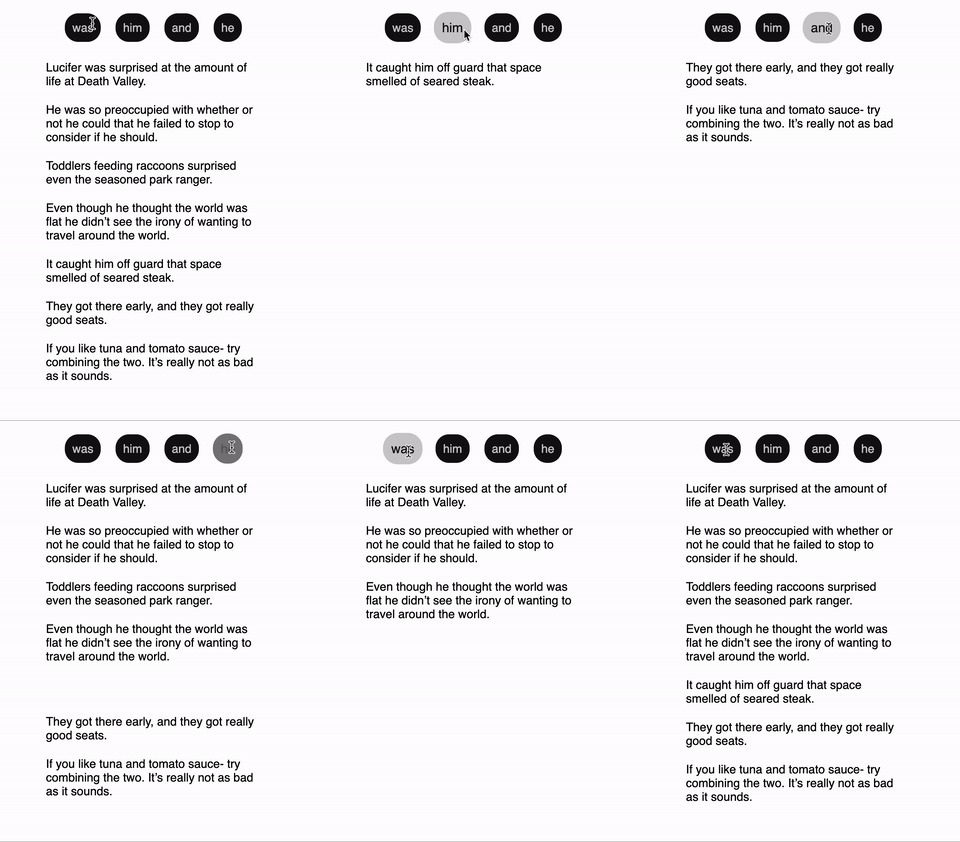
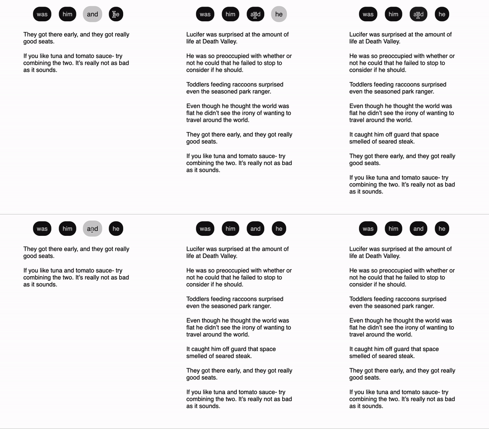
We'll be building the functionality using React+Typescript and we'll be adding the magic of animation using framer-motion. Let's get going! If things go well, we should end up seeing something like this.

Components
To build the functionality we mainly need 3 components.
- Wrapper - Will render the other 2 components and handle state sharing between them.
- Filters - Will render a list of `string` filters provided as props and whenever a filter is selected, it'll convey it to its parent.
- List - Will render a list of items. The Wrapper will maintain the logic of filtering and sending `List` the filtered set of items.
Let's start from bottom to top. `List` seems to be pretty simple to implement cuz all it has to do is take a set of items, map over them and render. For simplicity, I've considered a `ListItem` to be containing only 2 attributes - text and id. `id` has a very important role to play in our animations, we'll deal with it later. But in a real-world scenario, we'll almost always have a unique id associated with every element in an array.
/** List.tsx */

export interface ListItem {
  text: string;
  id: string;
}


interface ListProps {
  items: ListItem[];
}


export const List = (props: ListProps) => {
  const { items } = props;


  if (!items?.length) {
    return <></>;
  }


  return (
    <div className="list">
      {items.map((item: ListItem, index: number) => (
        <div
          key={`item-${item.id}`}
          className="listItem"
        >
          {item.text}
        </div>
      ))}
    </div>
  );
};
Next up, is our independent `Filters` component. This component will take the following props.
- filters - An array of strings to be displayed.
- currentSelectedFilter - A string which determines showing extra styles on the selected filter. For this blog, we're keeping it as a string as we'll rely on direct string match to apply styles to the currently selected filter. However, you can choose it to be an `id`, if your filters are more than a string. In that case, you can use the `id` to match the currently selected filter.
- onFilterClick: A callback function for the parent to determine which filter the user has currently selected.
/** Filters.tsx */

interface FiltersProps {
  filters: string[];
  currentSelectedFilter: string;
  onFilterClick: (clickedFilter: string) => void;
}


export const Filters = (props: FiltersProps) => {
  const { filters, currentSelectedFilter, onFilterClick } = props;


  const getClickFilterCallback = useCallback(
    (filter: string) => () => onFilterClick(filter),
    [onFilterClick]
  );


  if (!filters?.length) {
    return <></>;
  }


  return (
    <div className="filterList">
      {filters.map((filter: string, index: number) => (
        <div
          key={`filter-${index}`}
          className={`filterItem ${
            filter === currentSelectedFilter ? "selectedFilter" : ""
          }`}
          onClick={getClickFilterCallback(filter)}
        >
          {filter}
        </div>
      ))}
    </div>
  );
};
Okay, these 2 partially reusable components have now been built, and it's now time for us to wire them up together. Since we need some dummy data for items and filters. I've used a set of auto-generated sentences and put them under `ALL_ITEMS` and have hard-coded filtering strings and this list is called `ALL_FILTERS`. I've not put the dummy data in the blog as that's not necessary for the purpose.
Here goes our `Wrapper` component.
/** Wrapper.tsx */

export const Wrapper = () => {
  const [selectedFilter, setSelectedFilter] = useState<string>("");

  const filteredItems = useMemo(() =>
    selectedFilter === ""
    ? ALL_ITEMS
    : ALL_ITEMS.filter((item: ListItem) =>
        item.text.includes(selectedFilter)
      )
  ,[selectedFilter]);

  const onFilterItemClick = useCallback(
    (clickedFilter: string) => {
      if (clickedFilter === selectedFilter) {
        setSelectedFilter("");
      } else {
        setSelectedFilter(clickedFilter);
      }
    },
    [selectedFilter]
  );


  return (
    <div className="Wrapper">
      <div className="filterContainer">
        <Filters
          filters={ALL_FILTERS}
          currentSelectedFilter={selectedFilter}
          onFilterClick={onFilterItemClick}
        />
      </div>
      <div className="listContainer">
        <List items={items} />
      </div>
    </div>
  );
}
In all of these implementations, I've made use of the `useCallback` hook which prevents React from performing a few unnecessary operations (a good practice), and we can talk about the hook in a separate blog.
Rendering the Wrapper component now should give you something like this.

We have the functionality of filtering running. Let's move on to adding some cool animation to the list.
As I said earlier in the blog, the `id` plays a helpful role in animating the list. When dealing with layout animations, framer-motion relies on the `key` attribute of elements in a list to keep track of their position on the screen. So whenever the elements have to shift position due to other elements moving out of the DOM, framer-motion uses the `key` attribute to animate them from where they were, to where they are now supposed to be. It's pretty cool, according to me! :D Let's go ahead and add a few changes to our `List` component.
/** List.tsx */

...
import { motion } from 'framer-motion';
.
.
.

export const List = (props: ListProps) => {
 ...

  return (
    <motion.div layout className="list">
      {items.map((item: ListItem, index: number) => (
        <motion.div
          layout
          key={`item-${item.id}`}
          className="listItem"
          initial={{ opacity: 0 }}
          animate={{ opacity: 1 }}
        >
          {item.text}
        </motion.div>
      ))}
    </motion.div>
  );
};
To our container div, we've converted it to `motion.div` and added the `layout` prop, telling framer-motion that this element will be undergoing a `layout` animation. Any motion component with the `layout` prop undergoes animations using the `transform` CSS property. We've also converted the children `listItem` divs to `motion.div` and added the `layout` prop. Without this, we'd get a distorted animation. You can read more about this here. The `initial` and `animate` props tell the motion component that whenever it renders, begin with `opacity:0` and throughout transition duration (default 0.3s), change the value of opacity from 0 to 1. I'll be writing another blog which will get into a bit of detail about animating stuff using javascript. If you have constraints on the size of your served assets, you can look into writing your library to perform javascript animations, instead of using framer. However, there can also be a middle ground that you can learn more about on their reduce bundle size page.
Fin.
